On Visualizing Distribution Systems for Next Generation Power Distribution Grids
Foti M, Nasiakou A*, Vasilaki L, Vavalis M
Electrical and Computer Engineering Department, University of Thessaly, Gklavani, Volos, Greece.
*Corresponding Author
Antonia Nasiakou,
Electrical and Computer Engineering Department, University of Thessaly,
Gklavani 37, 38221 Volos, Greece.
E-mail: antwnianas@gmail.com
Received: May 17, 2015; Accepted: June 13, 2015; Published: June 21, 2016
Citation: Foti M, Nasiakou A, Vasilaki L, Vavalis M (2016) On Visualizing Distribution Systems for Next Generation Power Distribution Grids. Int J Comput Neural Eng. 3(1), 16-27. doi: dx.doi.org/10.19070/2572-7389-160004
Copyright: Nasiakou A© 2016. This is an open-access article distributed under the terms of the Creative Commons Attribution License, which permits unrestricted use, distribution and reproduction in any medium, provided the original author and source are credited.
Abstract
Three are the main objectives of this paper. Firstly, to review the recent technologies and techniques and the emerging methodologies for the visualization of powerflow analysis of distribution power grids. Secondly, to design a user friendly web based interface for visualizing the results generated by powerflow analysis simulation frameworks. Thirdly, to implement a visualization layer on top of GridLAB-D, a recently developed state-of-the-art, comprehensive and powerful simulation engine for modern power distribution systems.
2.Introduction
3.Visualization of Next Generation Power Grids
4.Self-organizing Map
5. Efforts for visualizing GridLAB-D
6. A Visualization layer for GridLAB-D
6.1 Design and implementation issues
6.2 Technical issues
6.3 Prototype implementation
7.Summary
8. References
Keywords
Power Grid; Smart Grid; Visualization; User Experience; Simulation.
Introduction
Smart grid relies on technologies that collect and organize large amounts of data concerning power production, distribution and pricing. These data need to be effectively retrieved, analyzed and delivered at almost real time to all stakeholders; from powerful operators to huge producers, to household consumers and soon to devices themselves. Compared to the legacy electric grid operation system, the smart grid provides new functionalities, such as support for decentralized power generation and storage capabilities, accommodation of plug-in electric vehicle charging stations, integration of vehicle-to-grid peak saving strategies and implementation of demand response decisions. The smart grid allows for customer participation in grid operation so that consumers will not only produce data but respond to data as decision makers within the context of demand response frameworks.
Information associated with power systems traditionally is presented to the operator as numeric data on single line diagrams or by tabular list displays. Due to high growth rate and integration of market forces, traditional visualization techniques need to be reviewed and enhanced.
It is extremely vital to present the vast amount of data to the various operators in a way so as to facilitate quick assimilation and assessment of the situation. Effective visualization of the system improves the operators’ ability to monitor and correct the anomalous conditions in a grid.
Furthermore, it is also of extreme importance to present these data to the consumers as well, in order for them to gain an active role in interacting with the system and to be aware of changing conditions to their energy use and behavior. Other stakeholders (e.g resellers, power production operators) benefit from the analysis of these data significantly as well.
Visualization in general is an established methodology in all areas of scientific computing. In this study, we investigate the capability of the visualization to affect the following major elements of power (smart) grid [23]:
Reliability is about real time monitoring all components (generation, transmission and distribution) of the power system in order to allow actions that make grid less vulnerable to manipulations and attacks.
Dependability concerns the usually rapid isolation of faulty areas and/or unwanted states.
Communication associates information flow and processing through smart metering in a way that enables advanced power grid management.
Redundancy is about protection and control and it is achieved by using a method which separates, faulty parts of the grid in a way that power still flows as required.
Efficiency is typically associated with how energy is consumed, produced and distributed according to the cliche, doing more with less.
In our study, we concentrate on Communication and Efficiency. For the rest elements additional work is needed. Our study is associated with simulation data, but it is our believe that realworld operational data can be treated in a very similar manner both in terms of design and implementation.
The rest of this paper is organized as follows. In the next section we briefly describe selected visualization efforts for next generation power grids focusing on recent efforts as well as on their anticipating main characteristics. Section 3 concerns Self Organizing Maps (SOMs) that combines visualization and machine learning to analyze data. Section 4 contains a summary of studies concerning visualization in a well established electrical distribution simulation framework, the GridLAB-D framework. In Section 5 we present the design and prototype implementation of a comprehensive web-based visualization layer for GridLAB-D. Our concluding remarks can be found in Section 6.
Visualization of Next Generation Power Grids
The power grid is known as the most complex human-made system. As such has to be supported in many aspects and visualization is one of the most important of them. Out of the plethora of the studies on visualizing the power grid1 we concentrate on the ones related to the smart grid concept focusing at the distribution level. We also restrict ourselves to non-commercial efforts. Commercial ones2 have their merit and surely their value but are beyond the scope of our study. The topology of any network is of obvious importance. The topological aspects of the power grid is considered in several studies (see for example [8, 27]). The power grid is a network composed of electrical elements, such as power transmission and distribution lines and transformers, used for delivering electric energy. The buses are the nodes and the transmission lines are the edges of the topology-based model of the power grid. This model is commonly represented by the un-weighted and un-directed graph (G = (V, E)), which consists of the set V of n nodes and the set E of the e edges. There exist several crucial parameters that characterize the model and their visualization is of great interest. Among them are the following: the degree (number of edges connected to) of each node indicating the importance of the node, the degree distribution depicting the general description of the node degree in the network, the clustering coefficient that implicatively forms clusters of nodes according to their interrelations, the network diameter (maximum distance between any two nodes) characterizes the size of the problem, and the path length (the distance between any particular two nodes) which indicates how close are they to each other. Coupling of the above parameters provide additional important information. For example, the network diameter and the path length could reflect the overall layout of the network.
The topology-based power grid model alone cannot fully represent the electrical characteristics. It needs to be coupled by an associated electrical-based model. In such model, the grid’s voltage and current distribution follows Ohm’s and Kirchoff ’s Law. Strong or weak electrical connections exist between indirectly connected nodes and the strength of the connection is measured with the help of electrical distance. One of the simplest measures of electrical distance, called electrical distance matrix, is the absolute value of the inverse of the system admittance matrix. It gives the sensitivity between voltage and current changes for every node pair of the system. With the help of that measure we may define a metric, which is analogous to node degree. Using the electrical distance matrix, it is also possible to produce a graph representation of the electrical structure of the power grid, focusing on representing strong electrical connections rather than direct physical connections. The data associated with the electric model that are required to couple the electrical-model and the topology-model, may be obtained through the solution of the powerflow problem. More on the simulation engine that provides these data for our prototype development needs will be given in section 5.
The various approaches to visualize the Smart Grid data at distribution, are classified in three categories: low dimensional, multivariate high dimensional and Geographical Information Systems (GIS) [6]. GIS based techniques are widely used. GIS uses spatial analysis and spatial- temporal analysis as geographical techniques. Spatial analysis, Interpolation analysis, Contour lines, Quantum GIS, Google Earth, Microsoft Chart and Matlab are commonly used visualization tools. Traditional methods consist of single line diagram, real-time 2D chart and 3D surface with contour techniques. The single line diagram provides an overview of the Automatic Metering Infrastructure (AMI)/SCADA network system as well as the substations interconnection. Real time 2D bar chart is one of the traditional techniques to visualize data. Instead of using static data, as in many other fields, in Smart Grid dynamic data are being displayed. The x-axis represents number of data points. The y-axis, on the other hand, represents the total power consumption of all load buses. When new data emerge, the one at the leftmost of the horizontal axis are replaced.
In order to visualize the power consumption, the grid operators also use the 3D surface with contour displays. Here, x-axis represents one hour intervals (1-24), y-axis the days of month (1- 31) and z-axis the power magnitude. Color contouring further boosts the display.
As far as multivariate high dimensional visualization technique is concerned, methods such as scatter diagram, parallel coordinate and Andrew curve are used. An example can be found in [6] where the following variables are considered: power consumption, load,
power factor, current and power loss.
Specifically, the scatter diagram is about viewing slices through lower dimensional subspaces. The parallel coordinate, is when all variables are displayed together, allowing operators to investigate higher-dimensional relationships between them. Andrews plot is a type of multivariate visualization as well. It represents each observation as a smooth function (each of which is a Fourier Series) over the interval [0, 1].
Please note that in general, geographic layout visualization tools seem to be more appropriate for the transmission system and they will not be considered in the rest of our study.
[20] considers certain characteristics of the prosumers (consumer and producer) and in particular those that may affect the stability of the grid. It focuses on Renewable Energy Resources (RES) placement based on:
• a map that depicts the limits of parcels and buildings and
• an aerial view of roof surfaces for installing PV panels in the future.
They provide a web based simulation tool, called Micro-grid Simulator, that provides to the consumers a convenient way to simulate a specific area of a grid by loading a map of their interest, using historical weather data and placing the RES in the location of their choice. Therefore, the consumers through suitable visualization techniques (the javascript library ”Highcharts”) could observe if the consumption exceeds the production of RES over a given time period.
[17] proposes a dynamic process for visualizing the transmission system of the smart grid through Geographic Data Views (GDVs). Traditional visualization techniques (color contours, dashed lines) require a priori the visualization data, while the GDVs display dynamically data. The displayed data include geographic information, like the location of buses, the position of the transmission lines and operating areas. Furthermore, the transmission operator has access to information about the state of the power system at any particular time instance. Similar to the aforementioned study is the one which is presented in [9] which primarily concerns, but is not limited to, operation centers. The visualization tools in the proposed platform are the following:
Maps, Flow animation, Localized Views, Area-Tie Diagrams, Graphical Alarms, Contouring and 3-D displays. A client-server system is used for the operation of the proposed system which retrieves real time data to be processed and displayed.
[21] integrates Google Earth platform with visualization components. The basic features of the resulting toolkit, named Visualizing Energy Resources Dynamically on Earth are associated with the status of the transmission lines, geo-spatiotemporal information, predictive models, the power grid topology and the weather conditions.
The Enhanced Controlled Spring Embedder Algorithm (ECSE) is proposed in [15] in order to visualize the power system based on geospatial data and the physical laws using one-layout diagrams. The visualization of the power system has three main steps; identification of the topology, insertion of the geospatial data and finally the ECSE algorithm is applied to dynamically generate the one-line diagram.
[7] presents a web based framework that deals with data collection, visualization, fusion and storage. Its main components are: a data stream database for storing data from various sources and a web system that displays the energy consumption and the current location of the users using MapReduce technology. The main objective of this paper is to decrease the overall electricity demand using the information about the energy consump- tion of each user in order to make them to have active roles in the operation of the smart grid by exploring the state of the power grid in a user-friendly way.
In [26] the GreenGrid visualization system, is proposed in order to in- vestigate the operation of the North American power grid. Its architecture and the visualization tools that are used do not follow the traditional ones. In fact, GreenGrid is based on graph analytics, especially in a multi-level weighted graph technique. With GreenGrid, the properties and character- istics of the grids are displayed on the map. Although, it does not provide information about the location of the components of the power grid it reflects its actual behavior effectively. It is claimed that the proposed approach is more efficient than the geographic layout visualization approach.
Simulation results regarding the power flow and the optimal power flow are considered in [13]. 3D visualization and animation mechanisms are described by focusing in the utilization of these mechanisms for training and education purposes. They upgrade the power system visualization to 3-D, animated with more colors for improving the way the power system (topol- ogy) and its simulations results (power grid’s state, component’s properties) could be deeply understood and analyzed. PSAT, a Matlab software package for power system analysis, is utilized for the development of the proposed techniques. Similarly to [13] but on top of an emerging and more advanced technological framework are approaches that utilize 3D printing paradigm. The use of 3D printing properties is particularly useful in modeling real world physical entities that could naturally include energy related ones. For details the reader is referred to [25] and the references within.
In [5] the WattDepot is presented, an open-source, web-based framework that collects energy data from meters, stores the data in a suitable Internet based repository and finally visualizes them in a way that is selected by the user. It actually consists of three main services (sensors, servers, clients) for which there exist a sequential interaction between them. In fact, the sensors retrieve data from a meter, stores the data in the repository of the framework and sends it to the web server. In turn, the clients request data from the server either for visualizing, analyzing or providing them to other services such as energy providers. The proposed framework could be also used as a simulation mechanism, to collect information about the generation of specific power plants or as a data storage mechanism.
[4] proposes an interface based on comparative information about users' participation and energy consumption and the involvement of the smart meters. A mechanism for visualizing smart grids using serious games is analyzed, in a way that assists the users in developing skills such as decision making and collaboration and helps them reduce their energy consumption. Actually, the visualization of the comparative information could be utilized from the users in order to have full knowledge about their energy behavior during a specific time interval.
Summarizing, we present in the table above an overview of all the above mentioned results categorized with respect to their most important characteristics.
Next we switch to systems where visualization is combined with machine learning components. A typical example in this direction is the use of Self Organizing Maps [10] (see also Section 3 below) that promise not only clear views of our data but the possibility to visually analyze data as well. For an example concerning an electric power system, the reader is referred to [19].
| reference | geo data | transmission | distribution | open source | commericial |
| [15] | ✔ | ✔ | |||
| [20] | ✔ | ✔ | ✔ | ✔ | |
| [17] | ✔ | ✔ | ✔ | ||
| [9] | ✔ | ✔ | |||
| [21] | ✔ | ✔ | ✔ | ✔ | |
| [26, 13] | ✔ | ✔ | |||
| [5] | ✔ | ✔ | ✔ | ||
| [7] | ✔ | ✔ |
Self-organizing Map
Self-Organizing Map (SOM) is a data analysis method. It classifies large dimensional data by projecting them onto low dimensional images in an orderly fashion and visualizes similarity relations of the input data. Although there is not yet a strong proof of the convergence of the SOM algorithm for initial data of general dimensionality and distribution it seems in practice to converge under a reasonable choice of parameters [11]. SOMs have been applied to problems from many disciplines. The rest of this section is devoted to the recent application of SOMs in power grids.
In [3] SOMs are used to identify malicious attacks on the smart grid. Such attacks could target, for example, in altering the consumers’ bills or cause a disruption in grid’s operation. The goal in this study is the clustering of data collected during grid operation into two classes, normal and anomalous. This is achieved in three steps. Firstly, data of a typical household are collected for the whole 24-hour period. Secondly those data are complemented with data of anomalous device behavior, and this results to a labeled data set. Finally this dataset is used to train a SOM in a way that it enables it to classify smart grid’s data as normal or anomalous and detect any intrusive activity through out the grid.
[14] presents an effort on identifying how dynamic pricing and demand response affects households. Here SOMs are employed to find the correlation of several building characteristics with the impact that dynamic pricing has on these households. For example, SOMs confirm that there is a correlation between the relative difference in annual cost, before and after dynamic pricing is applied, with the annual consumption in electricity. Experimental results presented lead to the conclusion that there is also a clear correlation between relative difference in annual cost with the surface area and the number of residents.
[18] describes an approach on customer base load estimation using both SOM and K-means clustering. More specifically, the proposed procedure consists of three steps: (1) Data preprocessing (selection, cleansing, reduction), (2) SOM and (3) K-Means clustering. Preprocessing phase is essential because during storage of data retrieved by the grid some information may be missing or be distorted. During the data preprocessing step historical data are read from a database, the more significant out of them are selected, the outliers are cleansed and the more suitable, in terms of weak-day or weather are pushed forward to the next step. SOM is then used to transform high dimensional data provided by preprocessing step, into two dimensional vectors. Subsequently, those vectors are clustered using K-means clustering. This procedure results in a base load estimation which is used for measurement and verification of demand response mechanism.
In [24] a SOM is utilized for the implementation of a neural network model. This model is used to perform predictive voltage stability assessments on the grid and predict emergency conditions. It receives measurements from the power grid and state variables computed by the devices of the grid. Consequently this information is provided to the SOM and it is classified based on security. Based on the input SOM classifies the power grid’s state as one of the following: (a) Emergency - Non-correctable, (b) Emergency - Correctable (c) Alert and (d) Normal.
The main goal of [16] is the recognition and modeling of controllable elec- trical heating loads of residential users. Taking advantage of the available data from smart meters and meteorological stations, authors propose their approach combining clustering and predictive regression modeling. Consumers’ clustering as electrically heated or not is performed using SOM and k-means algorithms, while prediction of hourly average power consumption is given using a Support Vector Regression model.
Efforts for visualizing GridLAB-D
GridLAB-D is an agent based platform for modeling and simulating power distribution systems using detailed models. It consists of four main, module based constructed, components that describe the most representative distribution system operations. Each module consists of classes and objects written in C++. Each object is an instance of a class, it has a set of attributes and the combination of the attributes’ values describe the state of the object during the simulation. The most significant module of GridLAB-D is the core module; it is responsible for managing and controlling the attribute values of the objects at runtime.
A simulation on GridLAB-D begins by instantiating the desired objects, with initial values for their corresponding attributes. GridLAB-D models are accessible via GLM (GridLAB-D Models) files which are the internal simulation files that describe the distribution system. Additionally, GridLAB-D provides .xml files that contain all the information concerning the output results of a simulation. Moreover, GridLAB-D provides a realtime mode, an HTTP-based API which supports actions such as readwrite on the attributes of specific desired objects.
However, GridLAB-D has only a text-based interface for controlling, modeling and monitoring power grids. To the best of our knowledge, it certainly lacks a GUI depicting the exact formation of a distribution system. In this section we present several recent efforts to implement a GUI for the GridLAB- D.
[22] contains a rapid generation-based approach for developing a GUI based on runtime model technology. Actually, the runtime model plays the role of an intermediate between the system data and the GUI, and it organizes the data in specific types in order to be easily accessible from the GUI. The GUI represents the objects that are selected by the user. The key attribute values of the objects and the connections between them are represented in a graphical view, reflecting the current simulation state of the power grid. Using the Eclipse GMF, each object of GridLAB-D is depicted with different shape while the attributes’ values are displayed together with the object-shape. Additionally, the users are able to select through the GUI specific elements, examine their inner structures or attributes and modify them. Every time a simulation runs on the GridLAB-D, the proposed system using the HTTP API offered by the GridLAB-D is able to retrieve information about the current state of the power system or the attributes’ values of the object participating in the simulation. All the information retrieved are visualized coupled with the topology of the network. The aforementioned framework focuses on the information about the state of the power grid and not on the simulation results.
The lack of detailed information about the system state of a power grid leads the authors of the [12] on developing an Electrical Data Recorder(EDR) for power grid analysis by capturing almost real time (every minute) highrate, low-voltage (LV) time series in different locations in order to provide information about the load and the current on these locations. All the information retrieved from the EDR is stored in a large database. For the efficient and the interactive modeling of power grids, a tool with a graphical interface for GridLAB-D and other simulation platforms is proposed. A java based electrical Simulation Modeling and Visualization Tool (eASiMov) is developed with simulation, modeling, large scale data acquisition, analysis and visualization features. eASiMov tool supports the visualization of the data acquired from the EDR and it uses the Open Street Maps in order to fit a grid model to geographical map. The ”connection” between the GridLAB-D and the eASiMov is established through the GraphML, which depicts in a proper way the objects of GridLAB-D. GraphML is responsible for the procedure of transforming the data of the power model in a suitable form in order the GridLAB-D to launch the simulation. The results when the simulation ends are transferred to eASiMov where they are displayed.
[1] presents GridMAT, an effort to integrate GridLAB-D with Matlab. It is a promising tool which combines the capabilities of both GridLAB-D and Matlab. Specifically, GridMAT (a) provides a user interface for the GridLAB- D users (b) assists the creation and debugging of models of a microgrid (c) models and simulates a power system (through GridLAB-D) and controls (through Matlab) the power system of a microgrid, especially in residential level (d) enable the designers to modify the simulation models and analyze the simulation results. GridMAT is rather close to the objective of this paper but despite the fact that provides plotting utilities, it’s primarily focusing on the modeling of integrated renewable energy, on demand response features and on the developing energy management controllers in order to reduce the peak load.
Gridspice [2] is a distributed simulation platform that integrates existing tools in order to use parallel techniques to manage large scale simulations. It consists of the following components: (a) GridLAB-D for the simulation of the distribution network (b) MatPOWER for the simulation of the transmission network and (c) Amazon Web Services for the virtual machines which are used for the parallelization parts of the simulation. GridSpice also provides, through a Python and a third party library, a graphical user interface in order to help the users to become familiar with the system, and to model, edit and design their simulations. The offered graphical user interface does not provide any visualization of the simulation results. However, it provides a kind of power grid visualization by using a GIS editor that uses Google Maps. GridSpice consists of the following components.
• A front end server which is the main component for interaction between the database, the simulation clusters, the user interface and the interface with external tools.
• An explorer editor and an object editor that provide a menu to update and edit the properties of an object.
• An importer through which the users could upload data associated with load and network models.
The aforementioned efforts that use the GridLAB-D for the simulation of the power grid system have different objectives. None of them has as its primarily goal to implement a friendly user interface for the GridLAB-D. All of them use GridLAB-D in order to simulate a distribution network for the needs and objectives of each particular proposed framework. GridMAT and the GridSpice are the two efforts closest to ours. GridMAT provides a GUI for the GridLAB-D in order to integrate control functions for the energy management of a distribution system. It provides selected results in a graphical way. These results are not representative for the state of the distribution network in each particular time instance. Actually, GridMAT provides information about the results produced about the demand-response and the control of energy management during the peak hours. GridSpice is primarily developed for managing large scale simulations and not for displaying the results of the simulation. It helps only in the visualization of the network.
We claim that our proposed web-based system is the only one that combines the representation of the simulation results and the visualization of the power network as well in a comprehensive and effective manner utilizing a plethora of recent or emerging technologies and visualization techniques. It is much closer to GridLAB-D than all the others.
A Visualization layer for GridLAB-D
GridLAB-D comparing with other simulation tools of power grids like OpenDSS, MATPOWER, interPSS, POWERworld lacks of an effective Graphical User Interface. So, we argue the necessity of a GUI that focuses on the results that need to be presented in a simple and intuitive manner. Next, we present in detail the design, the technical issues involved and the implementation characteristics of such a prototype GUI.
Our web application, is based on the widely adopted MVC (Model View Controller)3 architecture for building dynamic web sites with clean separation of concerns. MVC consists of three layers with fully independent capabilities. The Model Layer is responsible for storing and loading data to/from the application’s database, the View Layer for displaying on demand data for the user and the Controller Layer is the layer between the Model and View layer. More specifically, the Controller receives the requests for the application and in cooperation with the Model layer prepares the data which may be utilized by the View layer. In turn, the View layer utilizes the data that are available from the Controller layer in order to generate the response. In the next lines more details for each layer are presented.
Model layer is connected with the application’s database and it stores data provided by the Controller and represented in the View. The Model has no interaction with the Controller and View layer. The Model layer is actually the connection between the application and the database.
View is actually the visualization of data and the medium through which the users interact with the application. The most common languages that are utilized from the View layer are HTML, CSS, JavaScript and templates such as Angular templates mainly used from the view layer in the proposed application. AJAX technology is commonly utlized to integrate the View with the Model layer through Controller layer.
Controller is the decision maker and the intermediate layer between the Model and the View layer. The Controller is responsible for observing the changes of the model and in turn updates the view. The business logic of each web application is managed by the controller which also decides which model corresponds to each view.
In Figure 1 the numbered steps show the flow of information between the application and the MVC’s layers.
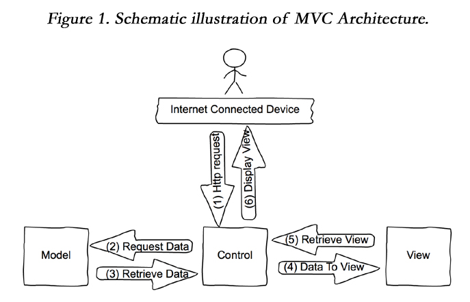
Figure 1. Schematic illustration of MVC Architecture.
As mentioned above, the objective of this paper is to design and implement a visualization layer for GridLAB-D. GridLAB-D and the web application are both connected to a common database. When a simulation model runs, the values of specific properties are stored in real time in the database. Details on how the user could navigate in the application are given in Section 5. For the design and the management of the database, Navicat, a database tool for MySql is utilized. It is responsible to simultaneously connect a MySQL database with a single application. As mentioned above, the results of a specific simulation are inserted into the database which is organized into tables for better and easy management.
The distribution network is commonly viewed as a series of nodes and links. Nodes act as aggregation points for the links that are attached to it. They hold the current and voltage values and complemented with other components that play a more specific role. In this spirit, the database is comprised of the following tables:
- Contains information about each node such as the nodeID, the phase, the voltage per phase, and the current per phase.
- Contains information about each house such a unique id, the phase, the total load consumed and the reactive power.
- Contains information concerning the triplex meter which connects the house to the grid and plays a crucial role in the distribution feeder. The columns of the table are associated with the nodeID in which the triplex meter is connected to, the real power and the reactive power at each time instance.
- Contains information about the devices belonging to a house. Each device has a unique device id, related to the house that it belongs. The phase, the type of the device, as well as the bid price and the bid quantity of each device and the total load consumed from the device are also depicted.
- Contains details about the distributed energy sources of the grid. This includes the node to which the energy source belongs, the type of energy source (e.g. Diesel, Wind or Solar), real, reactive power and the bidding price and quantity.
- Contains information related to the market such as the clearing price, clearing quantity, buyers' total quantity and sellers' total quantity.
- Contains information about the distribution transformers of the system. Only the power (real and imaginary) per phase are stored in that table.
More details about the tables and their characteristics are depicted in Figure 2. For each cell of the table the type is indicated (in the right) while in the left each indicator has different meaning. For example, the yellow icon of each cell indicates the existence of a primary key and the filled rhombus indicate a cell with NOT NULL value. The connection lines identify the dependence between the tables.
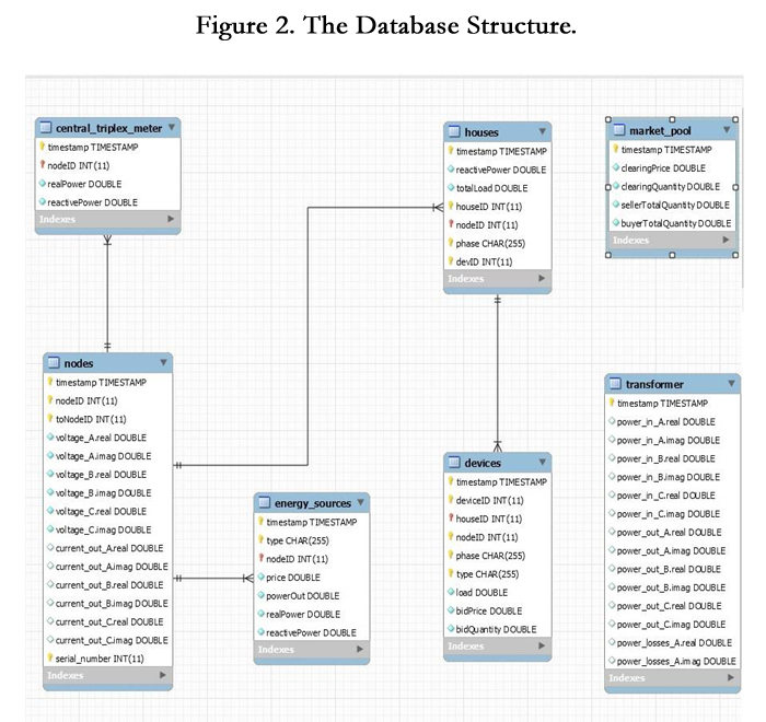
Figure 2. The Database Structure.
Next we comment on certain technical issues that are of significant importance for our prototype implementation. A Web Application is defined as a software which is accessible through the World Wide Web and consists of two main parts:
1. A web server which accepts requests and returns responses as HTML files.
2. A database server which accepts queries from the web application, executes them and responds with the results.
In general, front-end and back-end technologies are utilized for the development of the proposed web application. Front-end technologies are related to what you see in an application while back-end technologies provide the desired features of the web application.
The cross-platform runtime environment Node.js4, is utilized and no additional software like Apache HTTP Server or Nginx is needed. Specifically, we rely on Express.js a standard server framework for Node. js, designed to build from single and multi page applications to hybrid. Node.js applications could be built by using the Sails.js a recently developed web framework. Thus, users use a browser to communicate with the Node.js Server in order to have access to the application. Obviously, the HTTP protocol is used for the data transfer between the client and the server.
MySQL Relational Database Management System has been selected. It is the most common database as it is simple and suitable for the most database models.
For the implementation of the SOM component we have used an open-source implementation of a self-organizing map in Java Script for node.js from Lucid Technics, LLC5.
HTML (Hyper Text Markup Language), the most common front-end language is used. It is coupled with CSS (Cascading Style Sheets) for formatting and offering style to the web pages and JavaScript a widely used high level, dynamic and script language. The JavaScript library, jQuery that combines versatility and extensibility is also used.
Due to the fact that our application commonly involves asynchronous circumstances Ajax , a set of technologies used on the client side in order to create asynchronous applications is needed. Furthermore, JSON (Java Script Object Notation) another widely spread derived language from the Javascript has been used.
A most recently developed backend technology is the AngularJS7, an open source web application framework which works as follows: in the beginning it scans the HTML page by reading the tag attributes and it interprets those attributes to tie down parts of the page to a model.
In order to visualize the results of a power flow simulation in an effective way various visualization tools are used. Starting with SVG an XML-based vector image format for two-dimensional graphics and HTML5 Canvas, a component of HTML5 that permits dynamic, scriptable production of 2D images and shapes.
Additional Javascript libraries, like the Highcharts, the Charts.js and the Heatmap.js are utilized. The actual use of those libraries will be depicted in the next subsection where the web application is presented in some details.
Based on the previously presented design and the technologies described above we have developed a web application, named GridLab-DVisor, that collects, manages and presents data that come from the simulations of GridLAB- D using proper visualization techniques, so various patterns can be easily spotted by the users.
In order to visualize the results of a power grid simulation, we extend the functionality of GridLAB-D by first implementing the connection with the proposed application. Each table in the database is associated with an object of GridLAB-D modules. For instance, the table houses which has information about a house in the simulation model, has entries that are associated with the object house of residential module. GridlaB-D executes queries to the database to store information about consumption characteristics,such as the total load, the timestamp of that load and values of the attributes that this table has as columns. The main advantage of GridLab-DVisor is that the user of GridLAB-D has access to simulation results at real time. The user is not required to wait until the simulation is completed, rather that she can visualize the results will the simulation is still running.
Next we describe the interface used by the user to navigate our application.
The GridLab-DVisor visualizes the values of specific attributes of an object which is associated with a table in the database and a menu option in our application (see Figure 3). All the data displayed in the web application are dynamically retrieved from the database. For example, the nodes of the grid which is of at most importance in our application are dynamically retrieved from the database by executing a query which selects from table devices the records of the nodeID field. Each time a nodeID is selected, an additional query is executed. It reads from the database the phase which is associated with the corresponding node, the houseID for each house which belongs to that node.
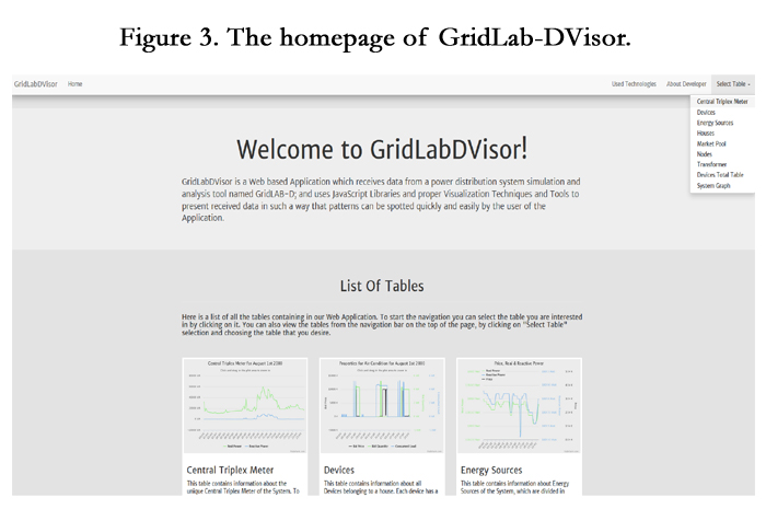

Figure 3. The homepage of GridLab-DVisor.
In a general view, the user has to select primarily the timestamp and the nodeID when visualization of the results associated with a triplex meter, a house, a device and a energy source is requested. Additional information, like houseID and phase, have to be provided by the user in order to visualize results for a specific house or devices that are included in the associated house.
Next, we give some screenshots of our web application focusing on how the data associated with the central triplex meter are presented. For visualizing the simulation results of other objects, the user has to follow the same procedure.
Let’s navigate to our application. Firstly, the user has to select the table from the index page (see Figure 4), in our case the central triplex meter. Before the graph is presented, a web page appears and the user needs to provide the date and the identification numbers of the nodes (see Figure 8) of interest. When the user selects to change the date, a pop-up window containing a calendar appears.
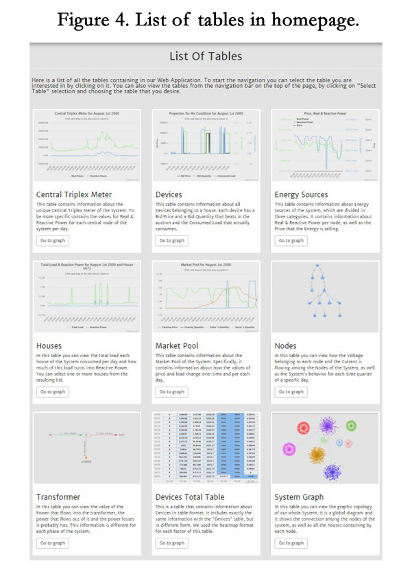
Figure 4. List of tables in homepage.
The user has to select a date that obviously needs to be within the simulation time interval in order to receive information through the graphs about the central triplex meter. When the ”Node ID” input is selected, a list of all nodes of the system is dynamic displayed to the user. The user may select only one of the displayed Node IDs. When the user fills the form and press the button ”Search”, a graph with the results for the selected day,which are retrieved from the database, of the Central Triplex Meter is displayed. The information which is associated with the Central Triplex Meter is the Real and the Reactive Power. In Figure 5, the Central Triplex Meters graph in a "Multiple Axes" Diagram is depicted. A multiple axes diagram, has a separate y-axis for each displayed variable and it is more accurate because of the number of its axes as well. In addition to ”Multiple Axes Diagram”, Line and Spider diagrams are also utilized to depict the information associated with that table. In the "Line Diagram" (Figure 6) the data for Real and Reactive power are illustrated in lines. Since data are continuous, they can be easily presented as line diagrams producing a clear and appealing result. Regarding the "Spider Diagram"(Figure 7), it is used in order to provide to the user a better view of system behavior within the time period.


Figure 5. Multiple Axis Diagram for Central Triplex Meter.
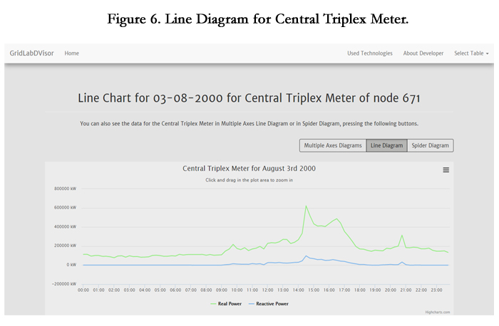
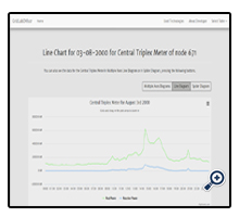
Figure 6. Line Diagram for Central Triplex Meter.
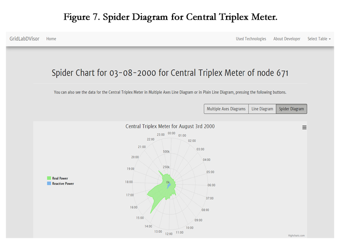
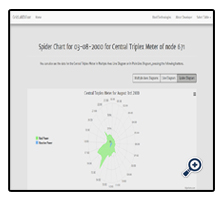
Figure 7. Spider Diagram for Central Triplex Meter.
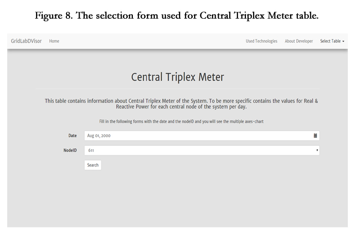

Figure 8. The selection form used for Central Triplex Meter table.
To use the SOM component the user has to select the features each input vector should contain. Those features are selected using the form in SOM initialization page (Figure 9). The user selects the simulation date of the data that will be classified using SOM, the object type, and the specific attributes, combined with some available mysql functions, such as MIN, MAX and AVG. In the specific example presented in Figures 9 - 10 user has selected to classify houses consumption behavior. The dimension of the input vector will be 6 as the user has selected 6 of the available attributes for each house: minimum reactive power, maximum reactive power, average reactive power, min total load, max total load and average total load during the time interval selected selected (see: Figure 9). The number of the input vectors will be the number of houses simulated for the date selected. In the final two inputs of the input form, the user selects the dimensions of the unified distance matrix (U-Matrix) that will be generated by the SOM component. In Figure 10 we view the result of the initialization described above. The result is a U-Matrix where each cell represents a map unit of the output space of SOM. Each unit is represented by a weight vector that effectively represents the input vectors assigned to that unit. The color of each unit represents the Euclidean distance from its neighbors. Light blue color is assigned to units with long distance with their neighbors, while dark blue color is assigned to short distances. With mouse over on each cell we can see the information each cell carries, which is the number of the input vector assigned to that unit, the value for each attribute selected and the distance between the unit and its neighboring units.
With a quick look at the generated U-Matrix we can observe that at the top left and bottom right units we have consumption patterns that are quite similar because of the color assigned to that units, while at the region in between we have quite diverse patterns, with long euclidean distance between them. With mouse over on the cell we can see how many houses are represented by each pattern.
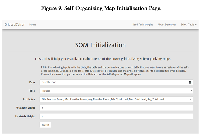

Figure 9. Self-Organizing Map Initialization Page.
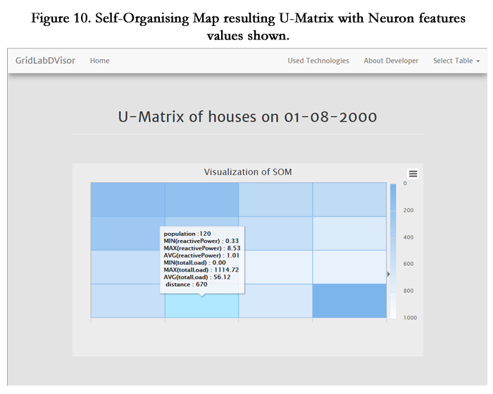
Figure 10. Self-Organising Map resulting U-Matrix with Neuron features values shown.
Summary
This paper presents a brief review concerning the current technologies and techniques that are utilized for the visualization of the next generation power grid. A state-of-the-art review associated with Self-Organizing Map is also presented in detail. Moreover, the efforts regarding the visualization of the GridLAB-D’s simulation results and a prototype implementation are described. GridLAB-D despite the fact that is one of the most prominent tools for power grid simulations lacks a user friendly graphical interface. For this, we extend the GridLAB-D platform by introducing two additional visualization layers. The first one corresponds to the visualization of the simulation results using techniques based on diagrams. On the second layer, Self- Organizing Map is involved for the visualization of the results.
The study of selected recent efforts that attempt to visualize the results of GridLAB-D’s simulations show that most of them focus on the utilization of GridLAB-D, and other similar simulation platforms, as backend in order to use the simulation results for their own specific and rather narrow purposes.
Finally, we should make clear that the proposed web application is by no means complete. Many additions and improvements could be considered. Therefore, this paper may be considered as an on-going effort towards a modern, effective and user friendly generic visualization layer for GridLAB-D.
References
- Al Faruque MA, Ahourai F (2014) Gridmat Matlab toolbox for gridlab- d to analyze grid impact and validate residential microgrid level energy management algorithms. Innovative Smart Grid Innovative Smart Grid Technologies (ISGT'14), Washington DC, USA. 1–5.
- Anderson K, Du J, Narayan A, Gamal AE (2014) Gridspice: A dis- tributed simulation platform for the smart grid. IEEE Transactions on Industrial Informatics, 10(4): 2354–2363.
- Baig ZA, Ahmad S, Sait SM (2013) Detecting intrusive activity in the smart grid communications infrastructure using self-organizing maps. Proceedings - 12th IEEE International Conference on Trust, Security and Privacy in Computing and Communications, TrustCom Melbourne, Australia.1594–1599.
- Bourazeri A, Pitt J, Almajano P, Rodriguez I, Lopez-Sanchez M (2012)Meet the Meter: Visualising SmartGrids Using Self-Organising Elec- tronic Institutions and Serious Games. 2012 IEEE Conference on Self- Adaptive and Self-Organizing Systems Workshops (SASOW), Lyon, France. 145–150.
- Brewer RS, Johnson PM (2010) WattDepot: An Open Source Software Ecosystem for Enterprise-Scale Energy Data Collection, Storage, Anal- ysis,and Visualization. 2010 1st IEEE International Conference on Smart GridCommunications (SmartGridComm), Gaithersburg, MD Maryland, USA.91–95.
- Dao VG, See OH, Do NY, Xuen CY, Chee LL (2012) Visualization Techniques in Smart Grid. Smart Grid and Renewable Energy 3: 175–185.
- Ghidini G, Das SK (2012) Improving home energy efficiency with E2Home: A Web-based application for integrated electricity consumption and contextual information visualization. Tainan City, Taiwan. 471–475.
- Hines P, Blumsack S, Cotilla Sanchez E, Barrows C (2010) The Topolog- ical and Electrical Structure of Power Grids. 43rd Hawaii International Conference on System Sciences, Washington, DC, USA. 1–10.
- Klump R, Schooley D, Overbye T (2002) An advanced visualization platform for real-time power system operations. Accepted for presen- tation at 14th Power Systems Computation Conference (PSCC), Sevilla, Spain. 1–8.
- Kohonen T (2013) Essentials of the self-organizing map. Neural Networks 37: 52–65.
- Kohonen T (2014) Matlab implementations and applications of the selforganizing map. Unigrafia Oy, Helsinki, Finland Europe.
- Maass H, Cakmak HK, Suess W, Quinte A, Jakob W, Stucky KU, et al., (2013) First evaluation results using the new electrical data recorder for power grid analysis. Instrumentation and Measure- ment, IEEE Transactions on, 62(9): 2384–2390.
- Milano F (2009) Three-dimensional visualization and animation for power systems analysis. Electric Power Systems Research 79(12): 1638–1647.
- Mononen M, Saarenpaa J, Kolehmainen M, Niska H, Rautiainen A (2015) Monetary impact of dynamic pricing and demand response on households: The winners and losers. 2015 IEEE Power and Energy So- ciety Innovative Smart Grid Technologies Conference, ISGT 2015 Washington, DC. 1-5.
- Mota AA, Mota LTM (2011) Drawing Meshed One-Line Diagrams of Electric Power Systems using a Modified Controlled Spring Embedder Algorithm Enhanced with Geospatial Data. Journal of Computer Sci- ence, 7(2): 234–241.
- Niska H (2013) Extracting controllable heating loads from aggregated smart meter data using clustering and predictive modelling. Proceedings of the 2013 IEEE 8th International Conference on Intelligent Sensors, Sen- sor Networks and Information Processing: Sensing the Future, ISSNIP 2013, Melbourne, VIC. 1: 368–373.
- Overbye TJ, Weber J (2015) Smart grid wide-area transmission system visualization. Engineering, 1(4): 466–474.
- Park S, Ryu S, Choi Y, Kim H (2015) A framework for baseline load estimation in demand response: Data mining approach. 2014 IEEE International Conference on Smart Grid Communications, SmartGrid- Comm 2014, Venice. 638–643.
- Ren F, Hu C, Tang Z, Peng T (2014) Load forecasting based on self- organizing map and support vector machines. Intelligent Control and Automation (WCICA), 2014 11th World Congress on, shenyang, China. 3148–3153.
- Rist T, Wiest M (2014) Interactive visual tools for the planning and monitoring of power grids. International Working Conference, 417–420.
- Shankar M, Stovall J, Sorokine A, Bhaduri B, King T (2008) Visualiz- ing Energy Resources Dynamically on Earth. Energy Society General Meeting, Pittsburgh, PA, Pennsylvania, USA. 1–4.
- Song H, Gallagher M, Clarke S (2012) Rapid gui development on legacy systems: A runtime model-based solution. Proceedings of the 7th Workshop on Models, 25–30.
- Tang GQ (2011) Smart grid management and visualization: Smart Power Management System. Expo on Emerging Technologies for a Smarter World (CEWIT 2011), New York. 1–6.
- Voropai NI, Kurbatsky VG, Tomin NV, Panasetsky DA (2012) Pre- ventive and emergency control of intelligent power systems. IEEE PES Innovative Smart Grid Technologies Conference Europe, Berlin, Germany. 1–7.
- Weber Z, Gadepally V (2014) Using 3d printing to visualize social media big data. CoRR, 1–2.
- Wong PC, Schneider K, Mackey P, Foote H, Chin G, Guttromson R, et al., (2008) A novel visualization technique for electric power grid analytics. IEEE Transactions on Visualization & Computer Graphics, 15(3): 410–423.
- Zhao J, Zhou H, Chen B, Li P (2014) Research on the Structural Char- acteristics of Transmission Grid Based on Complex Network Theory. Journal of Applied Mathematics 2014(2014): 1–12.